
Table of Contents
ToggleChoosing the right paint color for a home office isn’t just about aesthetics, it’s about creating an environment that supports how you work. The wrong shade can drain energy or cause eye strain during long video calls. The right one can sharpen focus, spark creativity, or project professionalism during virtual meetings. With more people working from home than ever, the home office has evolved from a laptop-on-the-dining-table setup to a dedicated space that deserves thoughtful design. This guide walks through proven color palettes, practical finish options, and real-world considerations to help transform a workspace without requiring a design degree or contractor’s budget.
Key Takeaways
- Home office paint color ideas should balance mood support and functionality—cool tones like blue and sage promote focus, while warm tones like terracotta energize creativity.
- Test paint samples on multiple walls at different times of day, considering how north or south-facing light affects color perception before committing to a full gallon.
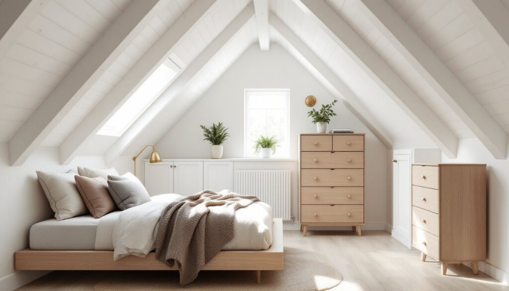
- Eggshell finish is the ideal choice for home office walls, offering durability and a professional appearance without creating glare on video calls.
- An accent wall behind your desk or visible on camera adds personality and visual interest without overwhelming the space, especially effective with deep jewel tones or warm burnt orange.
- Neutral palettes like greige, soft whites, and warm grays provide versatility and a professional backdrop that won’t distract during virtual meetings.
- Proper surface preparation—filling holes, sanding, and priming—is essential for bold or deep colors to achieve even coverage and prevent imperfections from showing through.
Why Paint Color Matters for Your Home Office
Paint color directly impacts mood, focus, and even perceived temperature in a room. Cool tones like blues and greens can lower heart rate and promote calm, ideal for analytical work or long stretches of screen time. Warm tones like terracotta or golden yellows can elevate energy and encourage creative thinking, but may feel overstimulating in small spaces.
Lighting plays a huge role in how paint reads throughout the day. North-facing offices receive cooler, indirect light, which can make already-cool colors feel stark. South-facing rooms get warmer, direct light that can intensify warm tones. Always test paint samples on at least two walls, one near the window and one opposite, and observe them at different times of day before committing to a full gallon.
Sheen also matters. Flat or matte finishes minimize glare on video calls but show scuffs easily. Eggshell or satin finishes offer better durability and subtle light reflection without creating hot spots on camera. More on that later.
Consider the room’s function. A home office used for client-facing video calls benefits from neutral or muted tones that won’t distract on screen. A creative studio or design workspace can handle bolder, more saturated hues that inspire and energize.
Calming Blues and Greens for Focus and Productivity
Blues and greens dominate home office palettes for good reason, they’re associated with concentration and reduced stress. Soft sage, seafoam, and powder blue create a serene backdrop without feeling sterile. Deeper shades like navy or forest green add richness and sophistication, especially in rooms with ample natural light.
Sage green has become a go-to for remote workers seeking a nature-inspired vibe without going full avocado. It pairs well with wood tones, brass hardware, and white trim. For a minimalist home office approach, sage works beautifully as a single-wall accent or full-room treatment.
Navy blue reads as professional and grounding. It works particularly well in masculine home office setups paired with leather, dark wood, or industrial accents. Navy can make a small room feel smaller, so balance it with white ceilings, light flooring, or plenty of task lighting. A single navy accent wall behind a desk creates a strong focal point for video calls.
Powder blue offers the focus benefits of darker blues without the visual weight. It’s a smart choice for north-facing rooms or basements where natural light is limited. According to House Beautiful, lighter blues are trending in 2026 home office renovations for their calming yet professional appearance.
Avoid overly bright or electric blues, they can feel cold and clinical, especially under LED lighting. Stick to muted, slightly grayed-out versions for a more sophisticated look.
Energizing Warm Tones to Boost Creativity
Warm tones, think terracotta, golden yellows, soft corals, and warm grays, create an inviting, energized atmosphere. These colors work well for creative professionals, designers, writers, or anyone whose work benefits from a boost of inspiration rather than strict focus.
Terracotta and rust tones bring an earthy, grounded feel. They pair naturally with wood, rattan, and greenery, making them ideal for spaces that double as a Zoom backdrop. Terracotta can feel overwhelming if used on all four walls: consider using it as an accent or pairing it with crisp white trim and ceiling paint to balance warmth.
Soft yellows (not school-bus bright) can lift mood and energy. Buttery or honeyed yellows work well in rooms with cooler northern light, adding warmth without turning garish. Yellow reflects light efficiently, which can help brighten a dim space, but it also shows imperfections in wall texture, ensure proper prep and use at least two coats of a quality primer.
Warm grays with beige undertones (often called “greige”) offer the energy of warm tones with the versatility of neutrals. They’re an excellent choice for multipurpose rooms or spaces where the home office shares square footage with a guest room or craft area. Many home office decorating ideas lean on greige as a foundation, layering in color through furniture and accessories.
Coral and peach are underrated options for smaller home offices. They’re energizing without being as intense as red or orange, and they photograph well on video. Pair them with white, natural wood, or matte black accents for balance.
Neutral Palettes for Versatile Professional Spaces
Neutrals remain the safest and most flexible choice, especially for homeowners who plan to sell or who want a backdrop that won’t compete with home office wall art or furniture. But “neutral” doesn’t mean boring, undertones make all the difference.
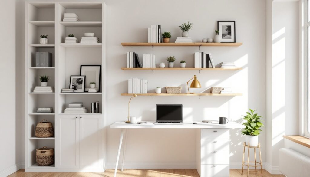
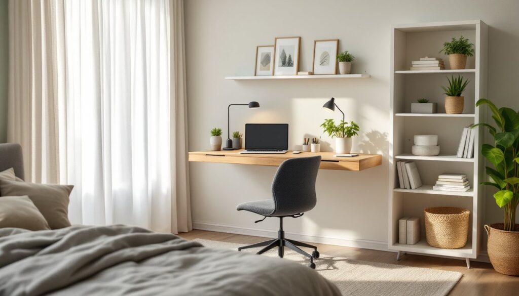
True whites (like Benjamin Moore’s Chantilly Lace or Sherwin-Williams’ Pure White) create a clean, airy feel. They maximize light reflection and make small rooms feel larger. But, pure whites can feel stark or cold in rooms with limited natural light. Pair them with warm wood tones, textiles, and task lighting to add depth.
Off-whites and creams offer warmth without color commitment. Look for shades with subtle yellow or pink undertones, which read as soft and inviting rather than dingy. These work well in rooms with southern or western exposure where warm light dominates.
Grays come in countless variations, cool grays have blue or green undertones, while warm grays lean beige. Cool grays suit modern black home office aesthetics with metal, glass, and monochrome palettes. Warm grays pair well with wood, brass, and layered textures. Test samples carefully: gray is notorious for looking different under various lighting conditions.
Greige bridges the gap between gray and beige, offering the sophistication of gray with the warmth of beige. It’s forgiving, hides minor wall imperfections, and pairs well with nearly any accent color. Popular greige options include Sherwin-Williams’ Accessible Beige and Benjamin Moore’s Revere Pewter.
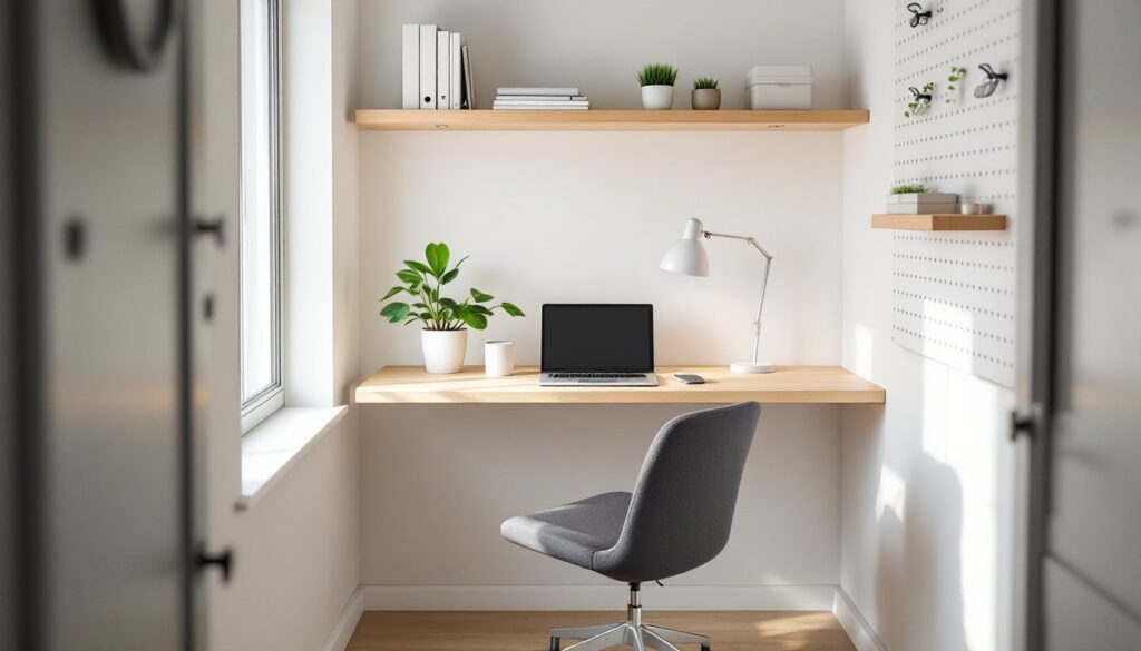
When working with neutrals, pay attention to trim color. White trim against a neutral wall creates crisp contrast. Matching trim to wall color (a monochromatic approach) makes the room feel larger and more cohesive, an effective trick for small home offices.
Bold Accent Walls That Make a Statement
An accent wall introduces color and personality without overwhelming the space. It’s a smart compromise for homeowners hesitant to commit to a bold shade on all four walls. The key is choosing the right wall and pairing it with the right complementary colors.
Which wall to accent: Typically, the wall behind the desk or the wall facing you as you enter the room. For video calls, the wall visible on camera is prime real estate, it sets the tone for virtual meetings and adds visual interest without distraction. Avoid accenting a wall with windows unless you’re prepared for color shifts as natural light changes.
Deep jewel tones, emerald green, sapphire blue, burgundy, create drama and sophistication. These work especially well in larger rooms or spaces with high ceilings. Pair them with lighter neutral walls (white, cream, or light gray) to prevent the room from feeling cave-like. Deep colors often require a tinted primer and multiple coats for even coverage.
Charcoal or black accent walls have surged in popularity for modern, high-contrast spaces. Black can make a statement in a custom home office with plenty of task lighting, white furniture, and metallic accents. It’s not recommended for rooms under 100 square feet or with limited light sources.
Warm burnt orange or rust adds energy and pairs beautifully with natural wood, plants, and brass fixtures. It’s a favorite in design circles for creative workspaces and has been highlighted by Home Bunch as a trending accent choice in recent home office projects.
Application tips: Use painter’s tape rated for delicate surfaces and remove it while paint is still slightly tacky to avoid peeling. Cut in carefully along edges with a quality angled brush before rolling. Two coats minimum, bold colors rarely cover evenly in one pass.
How to Choose the Right Paint Finish for Your Home Office
Finish affects durability, cleanability, and how light interacts with the wall, critical considerations for a workspace. The wrong finish can create glare on video calls or show every fingerprint and scuff.
Flat or matte finish absorbs light and hides wall imperfections like patched holes or uneven drywall. It’s ideal for ceilings and low-traffic walls. But, flat paint is difficult to clean, marks and scuffs often require touch-ups rather than wiping. Not recommended for homes with kids or pets.
Eggshell finish offers a slight sheen (about 10-25% gloss) with better durability than flat. It’s the most popular choice for home offices, wipeable, subtle, and it doesn’t create hot spots on camera. Most major paint brands (Benjamin Moore, Sherwin-Williams, Behr) offer eggshell as a standard option.
Satin finish has more sheen (25-35% gloss) and stands up to frequent cleaning. It works well for trim, doors, and high-traffic areas. Some homeowners use satin on all walls for easier maintenance, but it can highlight surface imperfections and may create slight glare depending on lighting placement.
Semi-gloss and gloss finishes are too reflective for most home office walls. Reserve them for trim, doors, or built-in shelving. They’re highly durable and washable, useful for a wood home office desk area that sees heavy use, but the shine can be distracting.
Application considerations: Higher-sheen finishes require better surface prep. Fill all holes with spackle, sand smooth (120-grit or finer), and prime. Skipping prep will make every imperfection visible. Use a quality roller cover (3/8″ nap for smooth walls, 1/2″ for textured) and maintain a wet edge to avoid lap marks.
Coverage: One gallon typically covers 350-400 square feet per coat. Most colors require two coats. Bold or deep colors often need a tinted primer and sometimes three coats for even saturation. Budget accordingly.
According to Young House Love, eggshell remains the go-to finish for DIY home office paint projects due to its balance of durability and appearance. It’s forgiving for first-time painters and delivers a professional result without specialized tools.
Conclusion
The right paint color transforms a home office from a functional necessity into a space that actively supports work, creativity, and well-being. Whether opting for calming blues, energizing warm tones, or versatile neutrals, the key is matching color to function, lighting, and personal work style. Test samples, choose the appropriate finish, and don’t skip surface prep. With a weekend, a few gallons of quality paint, and attention to detail, any homeowner can achieve a professional-grade workspace makeover.